

If your site isn’t funnelling visitors through to sales, it might be the appearance of your web pages that is putting potential buyers off. You need a website revamp to portray your business’s ideals and encourage visitors to become customers.
Researchers at YouTube discovered the core values that make websites successful. Website visitors make their minds up about a website in 17 to 50 ms, and they prefer simple layouts.
When embarking on a website rebuild to attract more sales, remember that simple is beautiful.
A 2002 study at Stanford University’s Persuasive Technology Lab discovered that site visitors pay more attention to the appearance of a web page than its content. Your site design might be blocking acceptance of your message.
In his book, Don’t Make Me Think, Steve Krug explained that people want to satisfy their needs as quickly and easily as possible. Websites with simple designs that encourage the visitor’s flow through to a sale are actually doing that potential customer a favor.
You don’t need to charm your target market in order to be successful, you just need to make it easy for site visitors to get what they want. Make your site more beautiful – specifically, it should be appealing to your target audience.
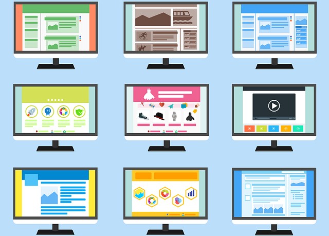
Site improvement categories
You need to appeal to a target audience, so define what your hoped-for audience considers beautiful before settling on your web redesigning project.
Examine these categories when deciding how to improve website design on your site.
Branding
A logo should encapsulate the ideals of your business or the site’s purpose. If you don’t have a logo, start your website redesign by creating one.
Targeting
The style of the site should aim at your target market. Establish your brand and your site theme so that it appeals to your target demographic.
Visual elements
Consider images, graphical elements, and page layout in this category.
Navigation
The navigation elements in your site should aid the visitor’s journey through each page and from page to page. Use menus, buttons, and links where appropriate.
Website Redesign Tips
Here is our list of the 12 tips to make your existing site look more beautiful:
- Tie your site’s theme into your organization’s branding
- Fit the site’s theme to the desires of your target market
- Pick an appropriate font for each text type
- Choose a restricted color palette
- Keep the background clear and the font color visible
- Include a picture at the top of every page
- Break up longer pages with additional pictures
- Avoid “walls of text”
- Use highlighted quotes to emphasis important facts
- Grade navigation elements
- Make the site’s banner and top navigation menu visible at all times
- Use buttons instead of links to direct the visitor to important pages
You can read more details of each of these points in the next sections.
1. Tie your site’s theme into your organization’s branding
Researchers found that site visitors spent more time looking at the logo on a web page than any other element, and that was the first thing they looked at before moving onto the rest of the page.
That first impression establishes credibility and trust and should be flowed through the entire site by copying the logo’s design elements. You will subliminally spread the authority of your brand throughout the site.
Make this rule your first guide to designing your site and you will establish authority, credibility, and consistency in your public image.
Try This Today: Examine your logo and make sure it portrays the ethos of your site.
2. Fit the site’s theme to the desires of your target market
Your site needs to be attractive to your target audience. Large companies hire market researchers when they start up a new product, or a new sales channel, such as a website. The researchers find out what the target audience wants and what appeals to them visually.
Don’t worry if you don’t have the budget for professional market research. You probably have people from every age band and income bracket in your family or in your neighborhood. Ask the people you know in your target audience what their favorite website is and test out design ideas with them.
Try This Today: Make a list of all of the people that you know who fit into your target audience.
3. Pick an appropriate font for each text type
Once you have an idea of the general style that appeals to your target audience (traditional, modern, funky, plain) put together three sets of font samples.
Write out a page of text, using each text type, such as title, heading, paragraph, and quote. Reformat the text in the three style sets and run them by your demographic test subjects.
You will use the winning text style set for your website revamp.
Try This Today: Look through the different style sets available in your favorite word processor to get an idea of the options that you can present.
TIP: To get the right font combinations, try using tools like FontPair and Typ.io
4. Choose a restricted color palette
Many designers recommend a maximum of five colors in any design scheme. However, to be on the safe side, limit your them to three colors. Black and white aren’t included in that count — you can have them as well. Of those three colors, one is primary and the other two are complementary.
The primary color should represent about 60 percent of all the color visible in your page. Of the two complementary colors, one should cover 30 percent and the other 10 percent of all of the page’s color.
An easy way to choose colors that go well together is to take them off the color wheel.

Ordinarily, you pick the color at the opposite side of the wheel to your primary color to find a complimenting secondary color. However, as you need three colors, locate your primary color and then form a triangle to get the two secondary colors. This is called a “triadic color scheme.”
Try This Today: Count the total number of colors used on your site. If it’s more than 3 then you need to replace some colors.
5. Keep the background clear and the font color visible
Avoid a background image, or at least, make it a very faint watermark. Varying levels of color and darkness in the background make it difficult to pick one text color for the whole document. Whether you choose light or dark text, a variegated background will render at least some of your text illegible, as shown below.

Jazzy font colors and flashing words damage the credibility of a site. Colors are OK for headings and for highlighting.
Make sure that the text is darker than the background and legible. About 50 percent of the population have astigmatism. Under this condition, a dark background causes text blurring.
Try This Today: Look through all of the pages in your site to check whether your current theme always makes text legible.
6. Include a picture at the top of every page
Include the date a summary/snippet at the top of blog posts and guides. This format imitates the layout of articles in newspapers and adds a subliminal air of authority to your web pages. Remember, if you want to know how to redesign a website to improve conversions, you will need to amplify the credibility of your presentation.
Copying the layout of credible news outlets will reassure your visitors and build trust.
Try This Today: Check each page of your site and think of an appropriate image to insert at the top of it if there is none there already.
7. Break up longer pages with additional pictures
If your Web page runs over more than 3,000 words, consider breaking it up with an additional image. Keep each image to a size so that text can be seen above and below it. Place the image just below the half-way mark.
Few people have an attention span that extends to absorbing lengthy passages. Adding in a picture at the mid-point of the article gives readers a little time to digest everything they read up to that point.
Don’t overstuff your articles with images, though. One image every 1,000 words should be enough.
Try This Today: Rank your website’s pages by word count, scroll through the longer pages to see where you could insert images.
8. Avoid “walls of text”
A fact-packed article can be difficult to digest and if all of the text is densely packed on the page, readers might become overwhelmed and give up on the article.
You can make a Web page more accessible by breaking up your text into shorter paragraphs.
Make a rule of a maximum of three sentences per paragraph. Vary paragraph lengths and don’t be afraid to write single-sentence paragraphs.
The example below shows how smaller paragraphs improve the readability of a passage of text.

Highlighting keywords in bold will also help to vary the appearance of each paragraph, making the whole page less monotonous.
Try This Today: Find the 10 most visited pages of your site and look in them for paragraphs longer than three sentences. If yes, find ways to reduce the length of each.
9. Use highlighted quotes to emphasis important facts
Break out of the paragraph style to create emphasis.
This format is also useful for highlighting important quotes. A keypoint interruption breaks up a wall of text, creates an eye-catching visual feature in the page, and draws the visitor’s attention to the most important information on the page.
Try This Today: Scan through your 10 most visited pages to see which sections could be enhanced by highlight boxes.
10. Grade navigation elements
Make navigation appropriate to the purpose of the page. Landing pages with requests for contact details won’t need as much navigation as a Home page. Use a top menu and a highlights side panel for your main site navigation.
Use links to point to external site that provides proof for the statements that you make on the page. Don’t make those links as prominent as the buttons that take the reader towards the delivery of your goal.
Try This Today: Plan the layout of your site to make room for navigation panes.
11. Make the site’s banner and top navigation menu visible at all times
Always let the visitor know where they are. This is reassuring – getting buried in acres of text can cause panic. Try to enumerate headings wherever possible because this also gives the reader a sense of progression.
Try This Today: Set the header section of each page on your site so it is a fixed panel.
12. Use buttons instead of links to direct the visitor to important pages
Make moving on to another page into an event. Don’t use links to direct people to important pages on your site.
Use buttons in text-breaks to draw readers off to a new stage in their journey through the site. Your text may be intended to get the visitor to buy something. However, lay regular jump-off points in the page for those who have already decided to buy and need no more convincing.
Try This Today: Create a button to use for navigation to important pages.
Be careful when defining “beautiful”
In this guide, we have covered some of the most important elements of a web page that can put people off from staying on the site. Remember, the appearance of your website is more important than its content.
The ultimate test of your website revamp will lie in its performance metrics. Keep an eye on bounce rate, time on site, and conversion rate to test the beauty of your new design.
Which tip in this guide did you find to be the most useful? Leave a message in the comments section below if you tried any of this advice to improve your website.
Useful Resources:
- Don’t make me think – by Steve Krug
- 10 Best Website Design Software in 2020
- Half Pant Hippo – for your website design, site maintenance and other needs.
- How to Hire a Brilliant UX Designer