

Studies show that 48% of people say a website’s design is the number one factor that helps them decide on the credibility of a business.
So is it by mistake or design that so many websites are crowded with walls of text, poor design, and frustrating navigation?
We’ve put together 10 of the most common mistakes of website owners and how you can avoid making the same errors on your website.
1. Not incorporating analytics to measure the success of your website

It’s all well and good to build a website, but things change quickly in the world of web design and if you’re not monitoring the performance of your site over time, you won’t know what to fix when the time comes to update it.
If your website is not bringing you customers, or your visitors are not taking the action you would like on your web pages, monitoring the following will let you know what to monitor and experiment with to improve:
- Track conversions (clicks on Calls to Action, form fills, etc.)
- Monitor pages are successful and which have a high bounce rate
- Track the traffic before and after you make any changes
These elements can all be tracked through Google Analytics, so make sure your website is connected and set up correctly.
2. No clear and easily accessible CTA for the visitor to follow

Netflix use a single, clear Call to Action prominently placed on the page
Imagine walking into a store. The products are displayed and they look good. People are picking them up and seem interested.
Then you look around in confusion. There’s no register. There’s no staff. How do I pay for these items? I have a question, but how do I ask? Does anyone even work here?
That’s exactly what happens when you don’t put a clear Call to Action (CTA) on your website. You can have the best-looking website in the world, but if you’re not making it easy for people to engage with your company, it’s pretty useless.
Some examples of CTAs include:
- Shop Now/Book Now: This is the most direct way to convert your prospect from a website visitor to a customer in just a couple of clicks.
- Contact Us/Get Quote/Learn More: Visitors to your website expect to easily find your contact information or a way to get in touch with you directly.
- Register/Subscribe/Sign Up: Encouraging sign-up to your newsletter or registering for an upcoming webinar can start the process of engaging prospects with your brand and your offering.
3. Not designing with SEO in mind

The design and functionality of your website means nothing if people can’t find it on the search engines.
Although most people will be pretty familiar with SEO on the content side of things, there are several technical techniques for improving your rankings that are just as important.
At the bare minimum, you should be making sure that all pages use a logical sequence of heading types, utilize meta descriptions, and ensure you have a site map created and kept up to date.
Search engines crawl all these elements with bots and use these technical components, as well as your keyword use and content quality, to determine where you appear in the rankings for specific search terms.
Knowing the basics of HTML can go a long way towards understanding how to boost your SEO. Ideally, all this should be built into your website as it’s being built. But if not, it’s always possible to go back and fix the errors.
4. Not monitoring and correcting site performance

Aside from the fact that it directly impacts your SEO success, having a site that does not perform well is frustrating to your visitors and, more often than not, will lead to them clicking away pretty quickly.
Among other things, you should monitor your website for:
- Slow load times
- 404 errors
- Buttons/CTAs that don’t work
- Content (including technical aspects like meta descriptions) is not duplicated
The security of your site is important, not just because of the security aspect itself, but because it can affect your site performance and impact SEO. To ensure your site is secure, you should:
- Implement the HTTPS certificate
- Make sure all certificates are up to date
- All links should lead to HTTPS pages
- HTTP URLs should not be included in your sitemap
5. Not designing for your audience

This cosmetics brand uses colour, graphics, typography, copywriting,and their CTA
to convey a clear brand personality for a specific target audience
It’s a tenet that permeates every aspect of business, and website design is no different: know your audience.
If you’re not designing your website with your target audience in mind, then they’ll find very little to connect with once they land on your page. Sometimes it’s good to subvert expectations and sometimes, not so much.
For example, a B2B software website is going to look very different to the website for a children’s entertainment company or a rock music blog.
The look and feel of your website is an important part of your brand and voice, so the design should fit your brand persona and speak to the expectations of your target audience.
6. Confusing navigation

Your visitor has landed on your website for a variety of reasons:
- They already know about you and are looking for contact information
- They searched for a term on a search engine and found your website
- You directed them to your website through promotional materials and they want to know more about your services
All too often, visitors land on a website and struggle with disorganized menus, a confusing purchasing process or where to click next.
Make sure you provide:
- a clear menu
- a way back to the home page/main menu at all times
- a Call to Action on every page
7. Not designing for mobile and tablet

40% of people will choose a different search result if the first is not mobile-friendly. So it’s not surprising that 62% of companies that designed their website for mobile platforms increased their sales.
The best way to evaluate whether you’re making this mistake is to open your own website from your phone or on a tablet.
- Is the text readable?
- Have any elements (graphics, forms, photos) been knocked out of place?
- Have any elements been resized in an odd way?
- Is the site “fitting” the screen or is awkward zooming or side-scrolling needed to view the website properly?
If so, what can you do about it?
Retroactively creating a responsive design for your website can be a mammoth task. Another solution is to build another version of your website that is specifically for use on mobile devices.
8. Upkeep and maintenance

Ignoring the necessary background maintenance of your website is the most common mistake that could cause you some huge issues down the line.
Security: unmaintained websites are more vulnerable to attack
User Experience (UX): visitors can be frustrated by “page not found” errors
SEO: search engines place updated webpages higher up in their results
So what should you be doing to avoid these issues?
- Make sure all plugins are up to date and your website is strongly protected
- Perform regular backups of your entire site
- Regularly update your website copy to keep up your SEO results
9. Ineffective website copy

Can you guess what this company does or the purpose of the website?
Users get frustrated when they land on a website where the message is unclear or they’re simply met with a single form or one static page.
It’s a fine balance between too much text or too little. The trick is to get the message across with punchy, engaging copy that explains who you are and what you do without confusing the visitor or losing their attention.
A good copywriter will be able to convey a message in as few words as possible while still making an impact and a lasting impression.
10. Outdated design
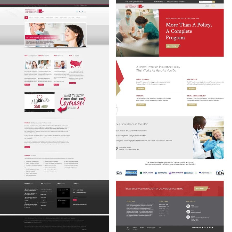
These before and after photos show how a fresh design can really elevate your website
There’s a time and a place for nostalgia and website design is not one of them. Outdated graphics and old fashioned styles will make it look like you don’t care. And if you don’t care, why should your visitor?
A report by Adobe showed that 38% of people will stop engaging with a website if the content/layout is unattractive. And outdated is unattractive.
Make sure your website layout and design are up to standard, especially when it comes to your competitors.
A handy way to benchmark this is to check out website awards in your industry to see what you’re up against.
Conclusion
You might recognize your own website in some of these common issues, or maybe they were true of a previous version of your website that you’ve now put to rights. Let us know how you have improved your website design and the impact it had on your business in the comments!
Either way, it’s pretty clear that a website mistake can have a direct and far-reaching impact on the bottom line of your business. Fresh website design can improve sales, increase customer satisfaction and brand awareness, and challenge the competition.


